
PACKAGING DESIGN | EXISTING DIELINE | COW KICKS
A mascot-driven design primed to snap into Slim Jim's profit margins.
CLIENT
Bull's Snack Sticks (Monogram Foods)
PROJECT SCOPE
Packaging Design, PDQ Design, New Visuals


CLIENT'S CURRENT PACKAGING

WHY DOES EVERY BEEF JERKY DISPLAY LOOK LIKE THIS?

MISSION/CHALLENGE
Monogram Foods has a problem. In a sea of meat sticks, their Bull’s brand gets lost--or worse, noticed for the wrong reasons. They’ve received feedback that their product is viewed as lower quality compared to their competitors and are struggling to keep up with better-known brands.
They've opened the brand up for a redesign, along with a rebranding if needed. The scope of this project includes redesigning their point-of-purchase/PDQ box using an existing dieline, as well as new wraps for their meat sticks.
OUTCOME
This is one of two concepts that made it to final prototyping stages, and is one of my favorite design pieces. Between the chaos of the kicking cow mascot and the color palette, something unlocked in my brain on this one that really separated it from a lot of my previous design work.
RECOGNITION/FEEDBACK
Called "unapologetic" by my Exhibition Design instructor, who has tried to get me to present this concept to Monogram Foods. (I'll let y'all know if I scrounge up the brass ones to do that.)
This is also my most upvoted design on Behance.
DESIGN APPROACH
FIRST DO RESEARCH, THEN DO WORD MAP.
On doing a word association exercise, I came to a conclusion:
When I go to grab a snack, it's because I need energy. If I can't grab breakfast or need to hold off until the next meal, I'll run into the gas station and grab a beef jerky.
So for this concept, conveying energy was the inspiration.
MY GOALS FOR THIS PROJECT:
-
Ditch the usual beef stick cliches
The majority of beef jerky and beef sticks are very visually similar: Red. Black. Yellow. Masculine typography. BORING.
-
Embrace the spirit of Monogram Foods
This is a company that literally gives out bacon samples instead of candy at an annual parade.
That's cool AF.
There's a spark there. But that feeling is missing from their existing design.
-
VISIBILITY to broaden demographic reach
This is a PDQ/point-of-purchase package that needs to stand out enough for an impulse buy. Marketing to dudes isn't enough--we need to appeal to women in the Target checkout line and possibly even their kiddos.

INITIAL COLOR PALETTE INSPIRATION
(SOURCE: Color Design Workbook - Sean Adams)
ADDITIONAL DESIGN INSPIRATION:
PAQUI
JACKBOX GAMES
THE STINKY CHEESE MAN
CONCEPTING


EARLY TYPOGRAPHY TESTS
RESTRICTIONS ARE FREEING
The client brief included required elements, including:
-
pricing information ($.75/stick and 3/$2.25)
-
an emphasis on their NO PORK recipe
-
a slogan: "meat stick with a kick"
These were great at informing design concepts.
We know this is not a high-brow brand.
We know these will appeal to consumers with dietary or religious restrictions.
And that last one was a happy accident.

SOME OF THESE SKETCHES INFORMED AN ADDITIONAL REBRANDING DESIGN FOR THIS PROJECT, "CLUCK AND BULL".

COLOR PALETTE TESTS - INCLUDING AN ATTEMPT TO MODERNIZE THE OVERUSED RED/YELLOW/BLACK COLOR SCHEME WITH A COOL-TONED RED.
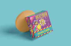
FINAL PRODUCT


 |  |  |
|---|---|---|
 |  |  |
DIELINES

