Monogram Foods/Bull's Snack Sticks
Disciplines
Packaging Design, Brand Visualization, Digital Mockup
A beef stick brand struggles to establish itself on the shelf next to its competitors, and is looking to up its game through a redesign--or rebranding, if necessary.
The Project
Bull's Snack Sticks are looking to redesign their product. Based on feedback, the current design calls the quality of their product into question. They are open for keeping the Bull's name with a visual redo or a complete rebrand.
There are phrases that must be included, including their "no pork" recipe, their stick with a kick slogan, and pricing details.
Client is asking for a new wrap design for two sizes of meat sticks and a front-drawer PDQ/Point of Purchase box with specific dimensions to fit an existing dieline.
This is one of two design concepts for this project.

Client's original branding.

Client Research
During the research phase on Monogram Foods, I encountered a website that didn't seem to tell the real story of the brand.
This is a company that gives out bacon samples at parades. They do philanthropic work with kids. Their employees are incredibly proud to work at their many locations. I wanted their branding to reflect some of this.
Demographic
Target audience:
someone grabbing a quick snack at a gas station
people in line at a checkout lane
anyone who packs a lunch
no specific age demographic
doesn't steer masculine or feminine
may be attracted to a product without pork due to religious or dietary restrictions
Design Approach
A word map exercise led me to a realization: When I go to grab a snack, it's because I want energy. In a pinch, if I can't grab breakfast or need to hold off until the next meal, I'll grab a beef jerky.
Every danged meat stick brand and their mom is the same thing: Red. Black. Yellow. Masculine typefaces. Blocky design. Yawn. Yawn. Yawn.
Bold, energetic colors would make this brand stand out at the register.
Design Process
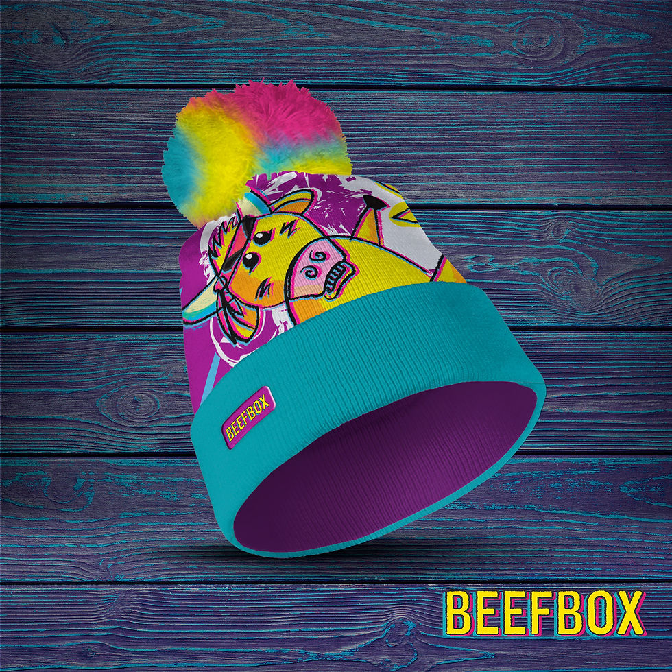
The kicking cow came flying into my brain out of nowhere during the sketch process and unlocked something I didn't know was in there.
The color palette morphed through multiple iterations of concept sketches. Next thing I knew, I had a beef stick brand with the least conventional color scheme I could think of--one that would definitely leap off the shelf and grab attention in a checkout lane.
It would SCREAM "energy". It would practically vibrate.